In the course of the Legend of Zelda Cosplay Project, I found that although the whole project was paying homage to a great game series, in some cases my pictures actually did the games a lot of favors.
For no picture was this more true than Scaldera.
Boss design in Skyward Sword tends to be on the cheesy side in general, but some, like Scaldera and Tentalus, really just lend themselves to satire.

What is it with the Legend of Zelda and one-eyed bad-guys anyway? Like 90% of Link's problems are solved by shooting an arrow in somebody's eye!

I actually sort of took on Scaldera on a dare. My brother Aden (who plays Link in the pictures) challenged me to try making the pyroclastic fiend. Originally, I wasn't really interested...but I just can't resist a challenge, and before I knew it I was working on the picture you see above.
Suggesting Scaldera
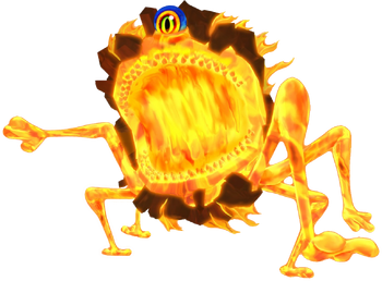
If I succeeded in creating a completely game-accurate Scaldera, then he would look like Mike Wazowski.
Rather than go down this route and simply add to the assortment of internet humor out there, I decided I would need to be more selective in which parts of the monster I included in my picture, and which I would merely suggest.
The Shape
There's an old song that goes "My hat, it has three corners; three corners has my hat. And had it not three corners, it would not be my hat."
Scaldera doesn't have any corners to speak of, but like a tricorn hat, Scaldera's basic spherical shape is essential to his design.

Image from: Zeldapedia.
I played around with a couple of other non-spherical lava monster designs at first, but it quickly became apparent that Scaldera's round shape was something I couldn't compromise on. If the final monster wasn't obviously round, then it would be completely unrecognizable.
The Eye
In addition to Scaldera's ball-shaped body, the lava monster's eye is equally critical to his design. I might poke fun at all the one-eyed monsters in the Zelda games, but if I changed much about that one eye then Scaldera just wouldn't be Scaldera any more.
However, to pull off a realistic Scaldera, I didn't need to be 100% true to the game design. Scaldera's eye is blue, which makes it easy to pick out and slash your sword at in the game, but also sort of clashes with his general pyrotechnic design.
So, I was able to change the eye color to match the rest of the body without sacrificing much recognizability.
The fiery eye of Sauron from The Lord of the Rings trilogy was the natural choice here. It took a bit of spherizing and perspective warping to get it at the right angle on the body, but in the end it worked out just right.
The Mouth
Scaldera has a large, gaping mouth that splits his spheroid body in half.
This is a large and important feature, so I didn't feel like I could do away with it entirely. Still, as it is in the game it looks pretty farcical, so in my picture I made some definite changes to the in-game design.
First, rather than going with a toothy, well-defined grin like in the game, I built the maw out of images of lava dripping over ledges.

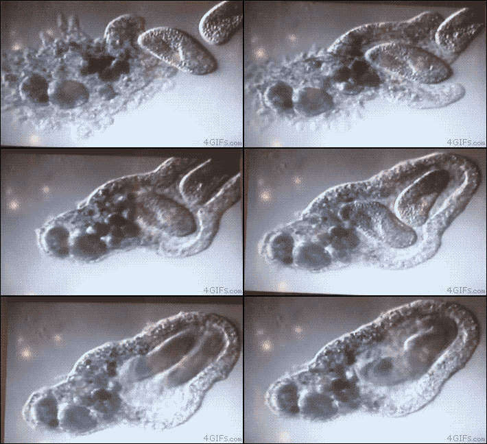
Lava dripping over a ledge looks vaguely like the teeth of a glowing monster. This was consistent with Scaldera's volcanic nature, and made him feel as though his mouth were simply a part of his molten body that pulls apart to engulf his foes--almost like a flaming amoeba!

Image from: Giphy.com.
Even though this concept for a mouth was pretty fun, it was still pretty different from the game. So. I decided to put most of the mouth right behind Link in the picture so you can't see much of it. That way. the bit that you can see looks cool, and your imagination fills in the rest!
The Legs
The last feature of Scaldera's body that I toyed around with were his spindly legs. In the end, I decided that there was just no way to make a tennis ball on toothpicks look epic.
Since I had already done what I could with the shape, eye, and mouth to make the monster recognizable, I figured the legs weren't necessary, and I obscured them behind a wall in the final image. That way, they could be there, but they aren't visible to detract from the epic action of the scene.
Capturing the Action
And speaking of action, choosing the right cosplay picture and the right moment of the boss battle to portray was critical in making the final image look intense and engaging.
After watching the fight a few times I decided the most action-packed scenes are:
- When Scaldera is rampaging toward Link, forcing him to flee, and
- When Scaldera has just eaten one of Link's bombs and the ensuing explosion shatters his rocky exterior.
To evoke the power of the blast I followed Blue Lightning TV's instructions for using Photoshop to create an exploding planet out of a simple picture of cracked mud:
This sphere became Scaldera's glowing inner body. For the breaking rocky exterior, I took images of semi-cooled a'a lava flows from Hawaii, and applied a radial blur to them so they looked like they were flying away in all directions.
Finally, I finished off the detonation effect by painting all around with Photoshop explosion brushes.
In the game, Link flees his fiery foe by simply running up a long ramp. I decided to intensify the action by choosing a more interesting terrain.
During our cosplay photo shoots, Aden (Link) and I love to use the sports mode on our camera to capture real movement. One lovely action sequence we shot involved Link jumping over a wall.
Simply replace the background trees with Scaldera, and it looks like he is diving over a ledge to safety only moments before either being swallowed by the Pyroclastic Fiend, or being roasted alive by a monstrous explosion!

Summary
In the end, through carefully choosing the right boss battle moment to display, selecting the proper scenery, and using discretion when choosing which parts of Scaldera to include in the picture, I was able to turn Mike Wazowski into a worthy foe for any hero!

Scaldera was created on a dare, but he still managed to turn out as something I could be genuinely proud of.
I guess the moral of the story is: Don't judge a boss by its cover!


