Ok, so this isn’t “cosplay” in the strictest sense… There are no costumes involved, but it counts for a good healthy dose of fan art!
My younger brother recently got his own place. At the same time I got myself a new lathe and chisels. Christmas was coming up so…I decided to help him decorate his rooms!
Naturally I wanted to give my brother something handcrafted from hardwood to give his pad a classy, masculine look. On the other hand, he’s a total nerd.
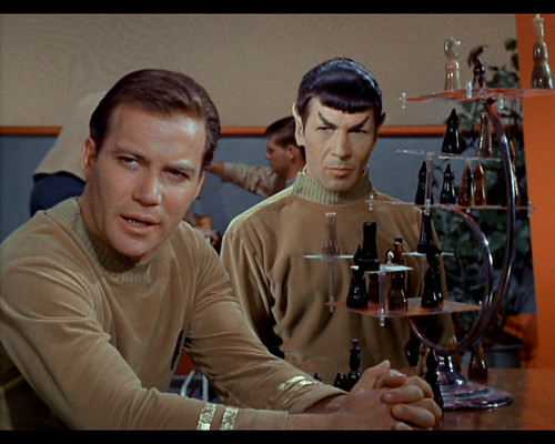
The perfect combination: A custom, handmade tri-dimensional chess board and pieces inspired by the immortal Star Trek Original Series!

This project was so much fun!
It was an artistic journey as I designed each piece in the set.
It was a brain-bending puzzle as I fit seven wooden chess boards together so that they matched the chess piece dimensions and could move in compliance with the rules of the game.
It was a creative laboratory–my first woodturning project which helped me develop crucial skills for later creations.
In the end, form and function came together in an awesome fusion of traditional class and sci-fi futurism!
In this article I’ll be focusing on the design process for the pieces themselves. If you want to know how I built the board then stay tuned–I’ll be posting that soon!
“On Screen!” Chess Sets in the Series
I made the chess pieces before I built the board, and I played with a lot of concepts for how they would look.
My first thought was to directly copy the designs from the show.
Star Trek: The Original Series features three different sets of chess pieces.
The first design appears only in the second pilot episode (“Where no man has gone before”) and appears to be made from ebony and jade. The pieces are too big for the board, however, and prevented its use for actual game play. I was careful to avoid this pitfall in my final design, but I’ll talk more about that in my post on the board construction.

Chess pieces from “Where no man has gone before.” Image from: Carolus Chess.
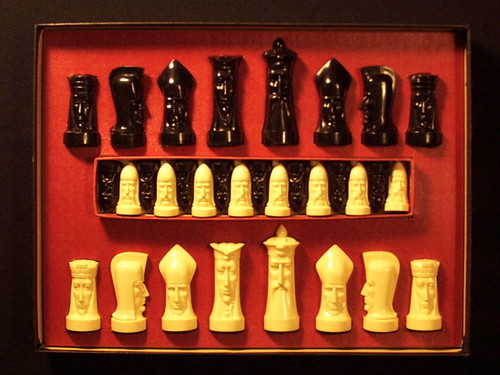
The second set appears only in a few early episodes. It is called the “Gothic” set and was designed by Peter Ganine to resemble various sculpted human faces.

Peter Ganine’s Gothic-style chess set. Image from: Carolus Chess.
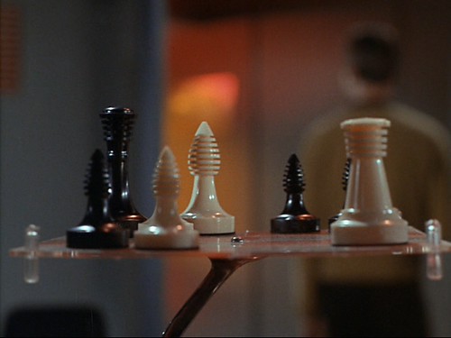
By far the most recognizable set, however, was another by Peter Ganine which he titled “Classic.”

Peter Ganine’s Classic-style set. Image from: Carolus Chess.
Despite their name these pieces had the modern look that the show was going for and became the series’ go-to prop.
The abstract shapes of these pieces are pretty basic and would have been a lot easier to make than the design I ultimately went with, but where’s the fun in straight-up copying somebody else’s work?
I decided to design my own set, but I made a big bow to Ganine’s “Classic” set by putting honey dipper-like slots on the head of each of my pawns.

History and Futurism
Since I was making my set out of wood I wanted a more traditional look so I set about learning the history of chess pieces.
If I ask you to imagine a chess set chances are that your mind will conjure up an image looking something like this:

A Staunton chess set. Image from: Wikimedia commons.
This design is one of many “Staunton” chess sets. The original Staunton concept came from Nathaniel Cook in 1849. He used simple symbols in his pieces to make them distinct and easily recognizable, and his design has since become the standard of tournament play around the world.
The reason that Cook created the Staunton chessmen was because prior to that point there were so many piece designs that when players used each others’ sets they couldn’t tell what was a pawn and what was a queen!
The earliest confirmed chess pieces to date were found near Samarkand in Uzbekistan and date from 1790 and since then a huge variety of chessmen have graced the gaming tables of the world.
Notable examples include the slope-cut Saint George design…

Image from: Chessantiques.com.
…the iconic Isle of Lewis chessmen…

Image from: Regencychess.com.
…and the towering Selenus chess set.
Image from: Dorland-chess.com.
This last design really inspired me. The top-heavy pieces appear to float above the floor. A gravity-defying stunt like this seemed like a perfect fit for the lounge of a starship.
When I worked out my final design sketches I followed the Selenus convention of having identical pedestals at the bottom of each piece. By using a historical design to evoke a space-age sense of weightlessness I hoped to fuse past and future into one harmonic whole.

The concept sketch I based my final peices on.
The combination of old and new is actually quite common in Star Trek, where the crew members are constantly collecting “antiques” and reminiscing about Earth history from before the launch of the television show.
To keep the pieces recognizable I topped each pedestal with a variation on the Staunton design, but I unified them visually by creating each from a similar egg-like shape.
By looking at my work-in-progress Adobe Illustrator schematics you can see how each piece was carved out of a similar peaked oval concept:

I chose this shape because it would make the upper part of the chessmen appear more plump and top-heavy (enhancing the floating illusion), and also because egg shapes always seem to have something futuristic about them.
Take the “Ship of Imagination” in Neil DeGrasse Tyson’s “Cosmos” series–it’s basically just a stretched metal egg, but it looks so at home in space.

Image from: 3dtotal.com.
Federation Issue
With my final sketches drawn up I felt like I’d managed to capture both futurism and traditionalism at once, but there was still nothing specifically “Star Trek” about my chessmen.
When I was brainstorming designs early on one idea had been to go ultra-Trekkie and make all of the white pawns look like little Federation symbols and all the black pawns look like Klingon symbols:

I love symbolism, but I like it to be subtle, and there was nothing subtle about this idea.
I didn’t completely reject it though. You’d probably never know unless I pointed it out, but I actually snuck little Federation chevron shapes somewhere in the design of almost every piece:

It’s subtle, but it’s there! (in blue). These are true Star Trek playing pieces!
Piece by Piece
Lastly, let me introduce the pieces to you one by one, and share the thoughts that went into their design.
Pawn

As the smallest and most common pieces on the board, the pawns have a slightly shorter pedestal than the rest of the set.
A simple round head easily identifies them as pawns, but as I mentioned before I spiced up the Staunton design with decorative notches evocative of those seen in Star Trek: The Original Series.
Since I would have to make 16 of these pieces for the complete set I also ensured that the pawns could be made entirely on my lathe without any extra carving. After some practice it now takes me only thirty minutes to turn a block of wood into one of these bad boys.
Rook

The rooks were the first design that I finalized in my concept sketches and they bear the egg shape the most clearly.
I felt like if the rooks didn’t have some kind of Staunton-esque crenelated cylinder shape then nobody would recognize what piece they were. Still, I abstracted the classic rook design by slashing obliquely instead of straight along the top of the tower.
This made it more difficult to carve the pieces, but they look a lot more space age.

Knight

Knights are easily my favorite part of any Staunton chess set. I love the proud looking horse heads and wanted to evoke the same feel in my Star Trek design.
I felt like horses might be a little too earth-bound for an intergalactic starship though, so I abstracted the design into a horned dragon-like creature that seemed more at home in the Star Trek universe.
Since they deviate the farthest from a basic round shape these pieces required a lot of hand carving and were by far the most time consuming to create.
Bishop

To look recognizable as a Bishop my pieces needed to be narrow in profile with a bulb at the top and a slit in the side of the bulb.
I modified this slightly by carving away the bottom of the bulb so that it looked like a Federation chevron and by putting slits on both sides.
Queen

The queen isn’t the tallest piece on the board, but she is the most feared. For this reason I made my queens wider and more visually massive to grant an imposing look.
A big chunky chess piece could easily be confused for the king though, so I lightened the design with a large hole through the middle, a trench above the hole, and slots below it. I also tried to give the queen a distinctive hourglass shape to evoke more femininity.
King

At 4 inches high the king is exactly twice as tall as the pawns and can even peer over his queen.
In opposition to my queen design, however, I didn’t want the king to look large and threatening because in the game it is one of the most vulnerable pieces and requires constant protection.
Therefore just as I gave the queen an hourglass shape, I sculpted the king to look like a tall, frail, but stately old man. He shares the slotted, perforated “crown” design with the queen, and on him it reminds me of the Eye of Sauron perched precariously atop the tower of Barad-dur.

Summary
It took me about three weeks to turn and carve the entire chess set, working about 1.5-2 hours per night.
Since it was my first ever woodturning project things didn’t always go smoothly and there were a few casualties along the way.

Even so it was a really fun creative project and I was very happy with the outcome.
If you’re interested in recreating these chessmen on your own then here are the schematics I used, with 1″ x 1″ squares for scale reference.

Comment below with some contact info and I’ll send you the Adobe Illustrator files.
A great chess set like this wasn’t enough on its own though. It deserved an awesome Tri-dimensional board…but that, as they say, is another story.


